PRACTICAL // how to fill an empty corner
SOURCE: PHOTO BY LIANA MINKAH ON UNSPLASH
Have you ever painstakingly selected all of the furniture, fixtures and accessories for a room only to leave the space with an empty corner that feels lonely and awkward? Well… you have come to the right place! Let’s dive into some ideas for making that forgotten, leftover space feel thoughtfully designed and integrated with the rest of your pad.
PLANTS
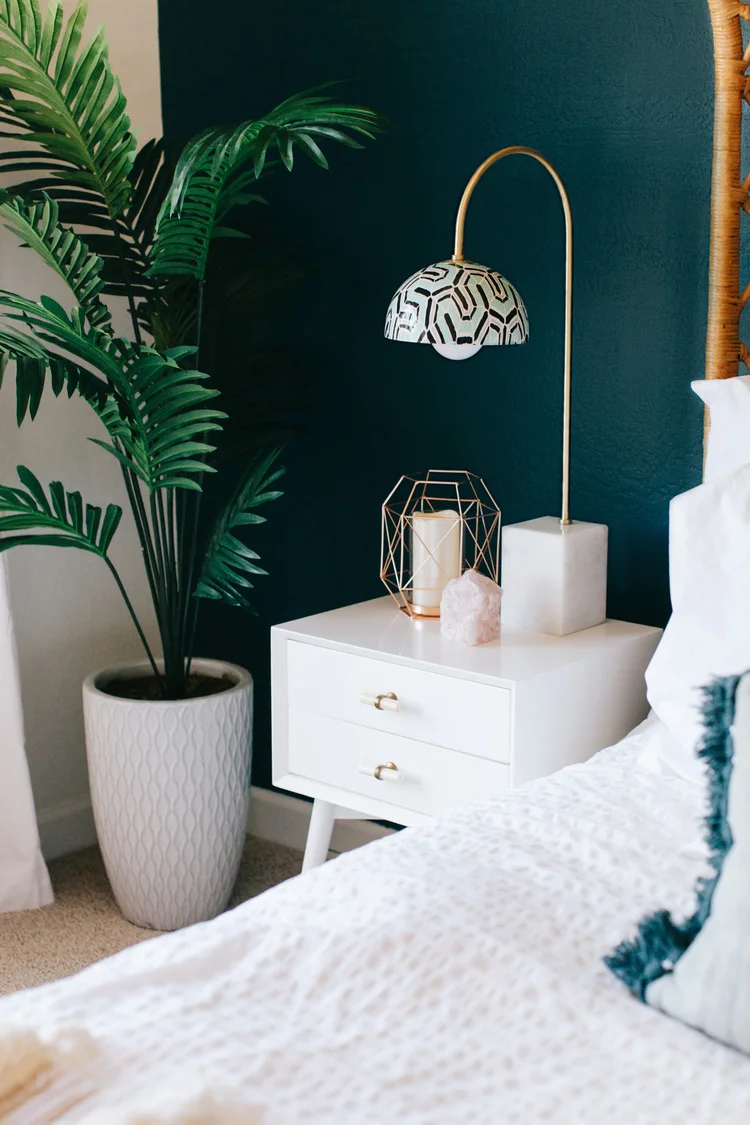
Designing with plants can really enliven a space since they are, well, actually living and “breathing” beings! Say goodbye to that lonesome feeling by inviting some leafy greens into your scheme. Side note: green also just happens to be my favorite color :) It is rich, vibrant and is one of those colors that truly plays well others. Whether you’re working off of a creamy white, rich blues or even vibrant yellows, green is a hue that can work with any base color you’ve got going in your space.
*Designer’s Tip: Work in levels when using plants for design. An empty corner with an extremely tall ceiling may call for a long skinny plant to fill the vertical. A broader corner may crave a collection of plants in alternating diameters and heights. Take inventory of the spaces you are trying to fill and make a list of dimensions/characteristics (full light, dry climate, etc). Visit your local nursery with that list and have them help you select the best greenies for your needs. They’ll also probably have some gorgeous vases that will add extra dimension to the assortment. You’ll feel good about pumping green ($) into your local economy while also bringing life to your space!
STACKS
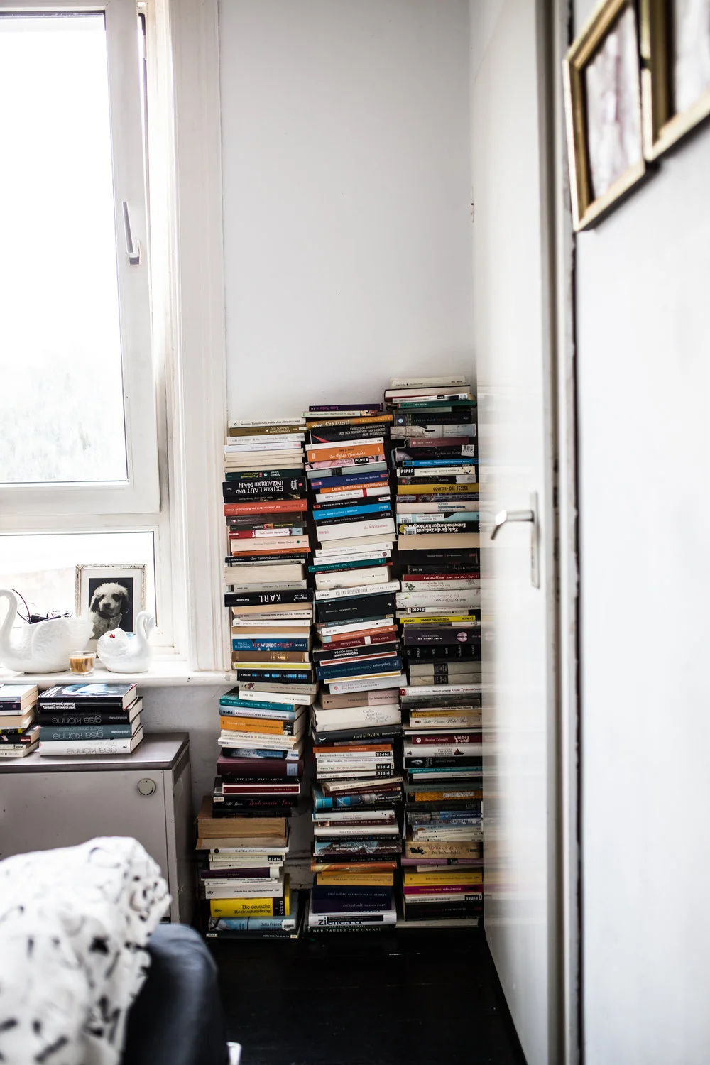
Here’s to all of my fellow nerds out there who just love the look of a slightly worn magazine or hardcover book. Let’s face it… these items will most likely be a commodity in the future with all of this technology taking over! So why not collect and display these treasures while populating a desolate corner with text/titles that can really give guests a vibe of your unique personality and style.
**Designer’s Tip: Work in “collections”. Do you have a subscription to a trade periodical or a magazine on the topic of your favorite hobby? Stack the issues from the same magazine together to exhibit a cohesive feel while also showing diversity. Example: way back in the day when I waited tables I had a dear, dear customer bring me some vintage Architectural Records issues from the 80s (he knew I was heading off to study architecture and wanted to pass on his collection). The browned edges and dated graphics exhibit a vintage feel while also linking telling the story of my interests. It’s an interactive way to invite exploration that can spark up a compelling conversation with visitors and it’s much more sustainable than tossing those pages into a landfill!
STORAGE
Who among us has not . said the words “I need more storage!” Take advantage of leftover corners to store items that don’t seem to fit in other spots! Blankets, nick knacks, personal collections, clocks, or even beauty products can feel at home in these areas.
**Designer’s Tip: Curate the type of storage to the particular items are being displayed. Ladder style shelving tipped to sit against a wall is a configuration to hang useful blankets and towels for guests while gridded shelving can serve as the great index backdrop to display your personal matchbox car collection. Wall shelving mounted at different heights can serve as a great solution for a collection of lotions, potions, candles, mirrors, and personal care items. Select your fix by working backward from your desired storage items and it will all feel just right!
I say let’s give our corner spaces a little bit more love and they will, in turn, show us love right back!
I hope this post helped you solve for your space. I would love to see the unique results you have implemented in your home and work spaces to make your environment uniquely you!
**If you want to share your space please email photos and descriptions to: revive_architecturaldesign.com and you could see your creative genius featured in our follow up posts!
SOURCES:


